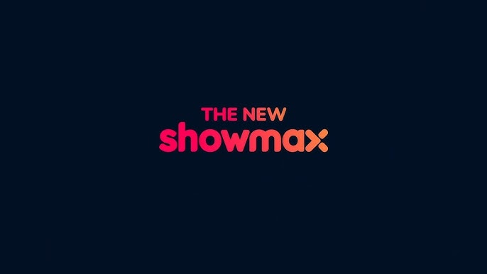

MultiChoice’s Showmax, the popular video streaming service, will soon be undergoing its third brand change in its nine-year history. Following extensive consumer testing of 100 new names, the decision was made to keep the Showmax name and instead change the brand’s colours to an ombré-infrared infused livery, a red-to-red colour scheme that will position Showmax in direct competition with Netflix, its biggest rival.
The relaunch of the video streaming service will be carried out in collaboration with Comcast NBCUniversal’s Peacock streamer. The new Showmax will feature a redesigned logo, replacing the little pink and turquoise “double lane” stripes with a red-worded logo and a diced “x” at the end, which will also be used as a profile avatar within the app.
The brand’s new colour palette incorporates shades of red, pink, orange, and black, with the Showmax word utilizing a “red pink-orange” gradient.
According to Yatish Narsi, Showmax’s Chief Marketing Officer, the rebranding was tested across all markets and was well-received by customers, with 80% preferring the new brand. The decision to change the brand was made with customers at the forefront, and the team hopes that the new brand will capture the products that customers love and make the Showmax experience even better. The new look will be officially launched on January 23rd.


